Breakthrough Communication for transforming people problems in your workplace
Courageous Conversations Master Classes | Coaching and mentoring
Kia ora, I'm Cher Williscroft
I have over 38 years of experience coaching and training people to create harmonious relationships, productive teams, and workplace cultures that have a clear and respectful approach to conflict or difference. I offer one-day Master Classes in Courageous Conversations, offered at a time that suits you, that give you potent communication methods that breakthrough and solve your people problems with skill and confidence.

Get your complimentary 7-day e-learning course on the
7 golden rules for communicating clearly and fairly in the workplace
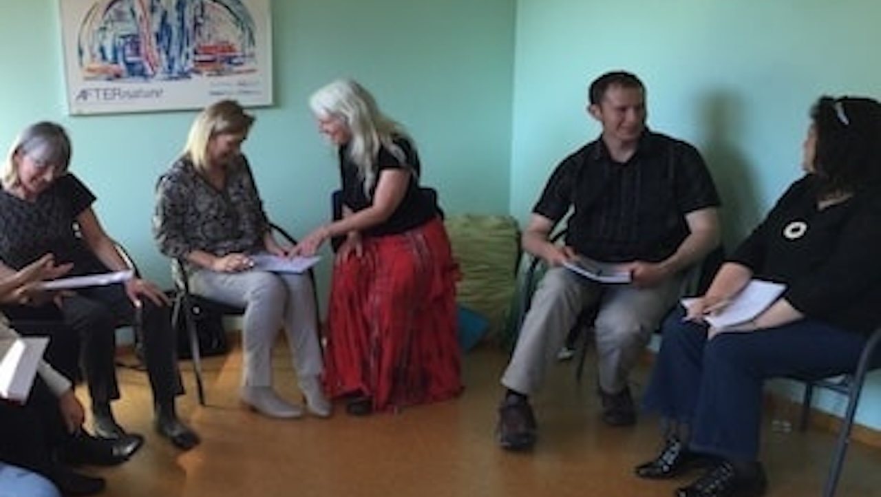
Courageous Conversations Masterclass

Leadership Coaching
We have been working with Cher to help staff develop their communication and collaboration skills. Cher has helped people understand their own style and how to get the most from it as well as focusing on relationships as well as outcomes. Cher’s experiential style takes people out of their comfort zone in a safe and supportive way that makes a real difference over a short time.